Landing page creation
One page, one purpose
Present one clear offer and guide visitors towards a useful action.
From€3,000
Mobile interface improvements
Visitors have to zoom, hunt for a button or work around an oversized block. We improve a focused mobile journey without imposing a full redesign.
 A project shaped around you.
A website that works on a desktop may be awkward on a narrow screen. We review spacing, text sizes, touch targets and the behaviour of long content.
A layout example, not a real measurement.
Concept demonstration — not a customer result or a real assessment.
The package covers up to three page templates on a compatible existing website. After reviewing the journey, we adjust responsive rules and check important states. Theme and module limitations are highlighted.
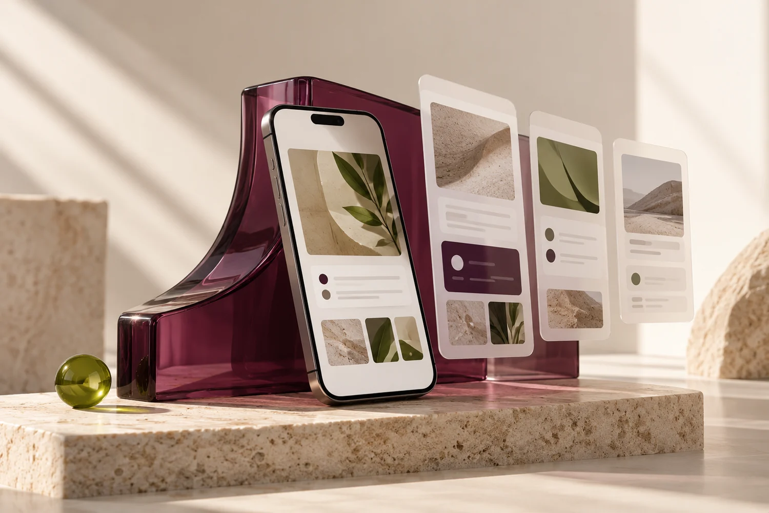
Illustrative example: a long service page gains clear hierarchy, a reachable action and fields that stay within the screen width.
HTML/CSS improvements to a compatible site. Rebranding, native apps, theme licences and guarantees across every device are excluded.
No. The scope covers up to three page templates.
No. These changes may improve usability but are not a complete regulatory audit.
Landing page creation
Present one clear offer and guide visitors towards a useful action.
Existing website review
A structured look at your website, from first impressions to points of friction.